Documentary Photography
Image Development
New Technologies
Graphic Design
Directing
People
Technical Skills and Digital Worflow
Research and Discourse
Art Photography History
Professional Practice Skills
Collectives
Speech
Portfolio
Back to Start
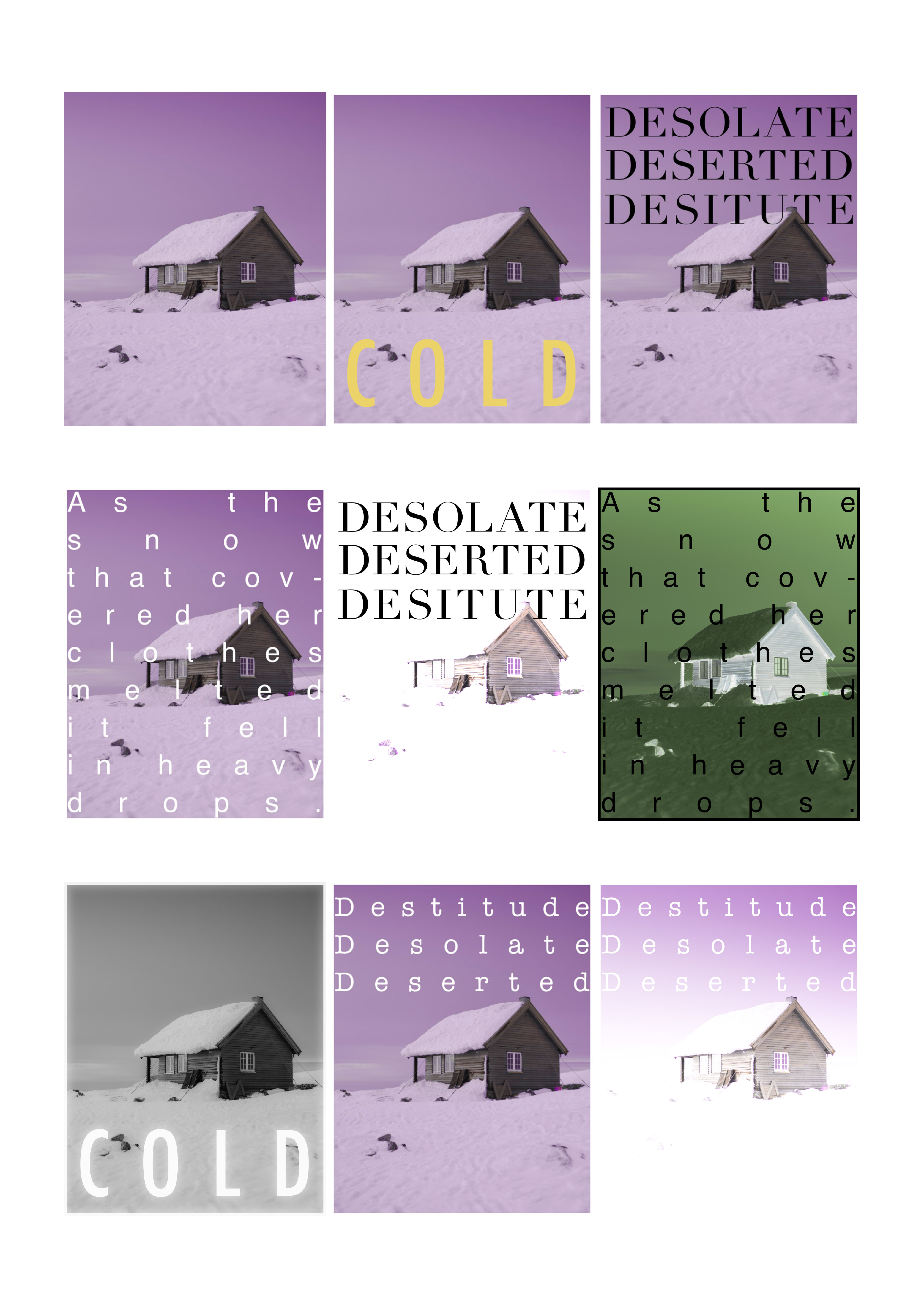
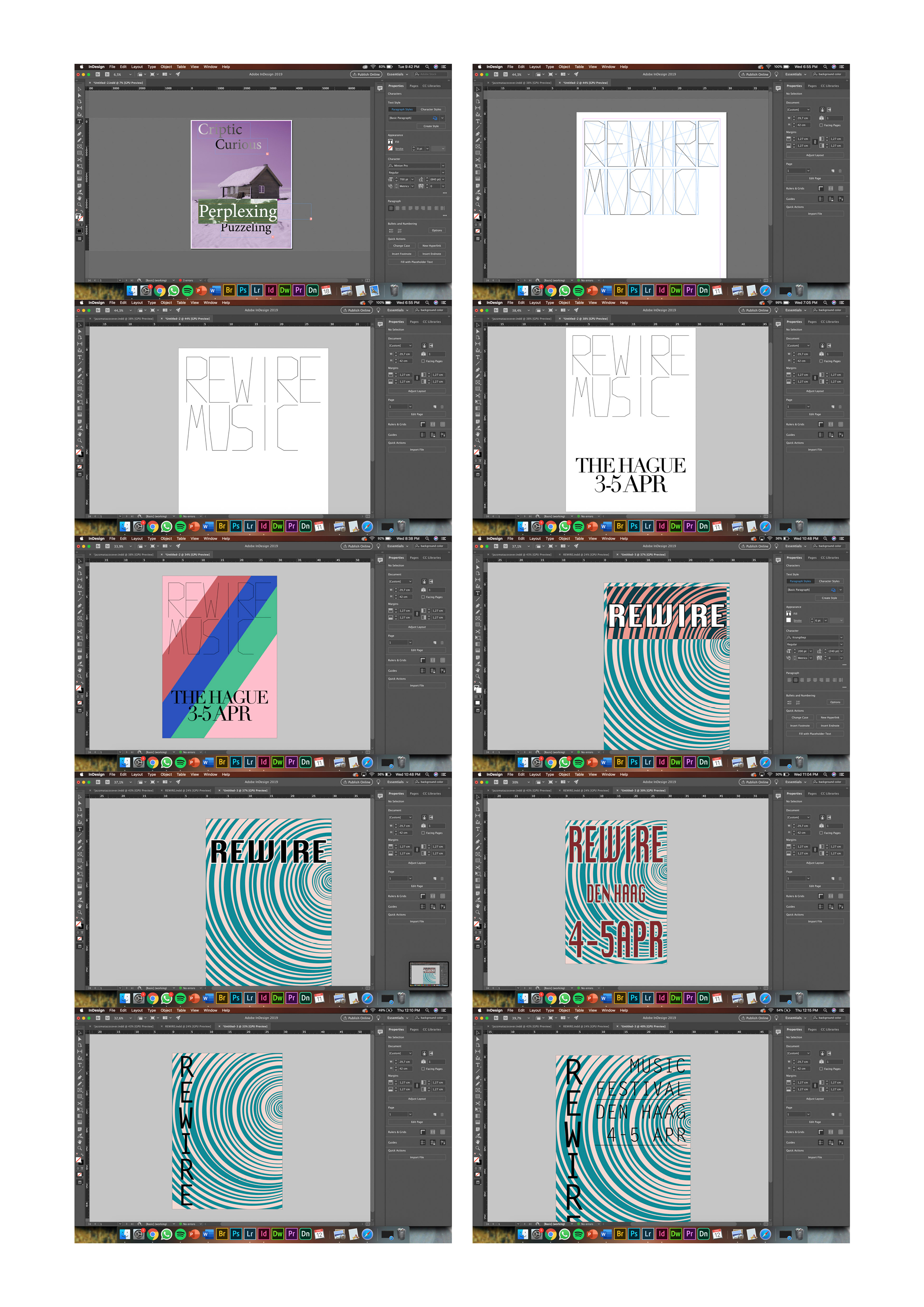
These are the sketches or the screenshots of them, that I made during the making of all the posters. Unfortunately I threw away the Word documents. That would have been a nice comparison to make.
On the left, the white ones, I tried to make my own font. Of course I know that designing letters is a lot more than just drawing or putting lines of paper (however, basically that’s exactly what it is). But not a lot of thought went into them. A lot of time did though. I wanted to make a thin lettertype that looks very square. I like the monospaced from the typewriter interface. I used rectangles firts to predict the size of the letters themselves. Later I would measure certain lines. And if you look closely you can see a lot of similarities amongst the letters.
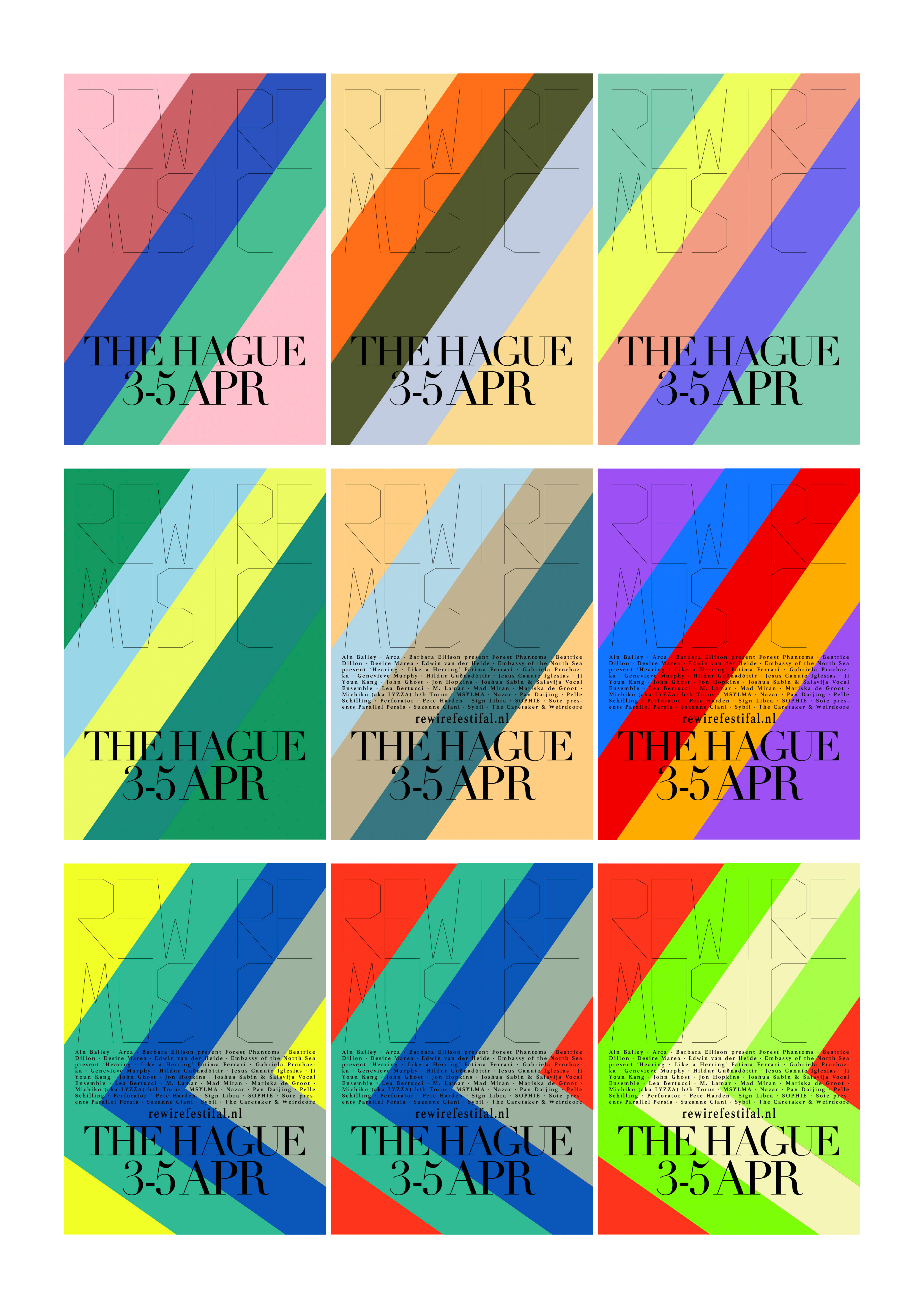
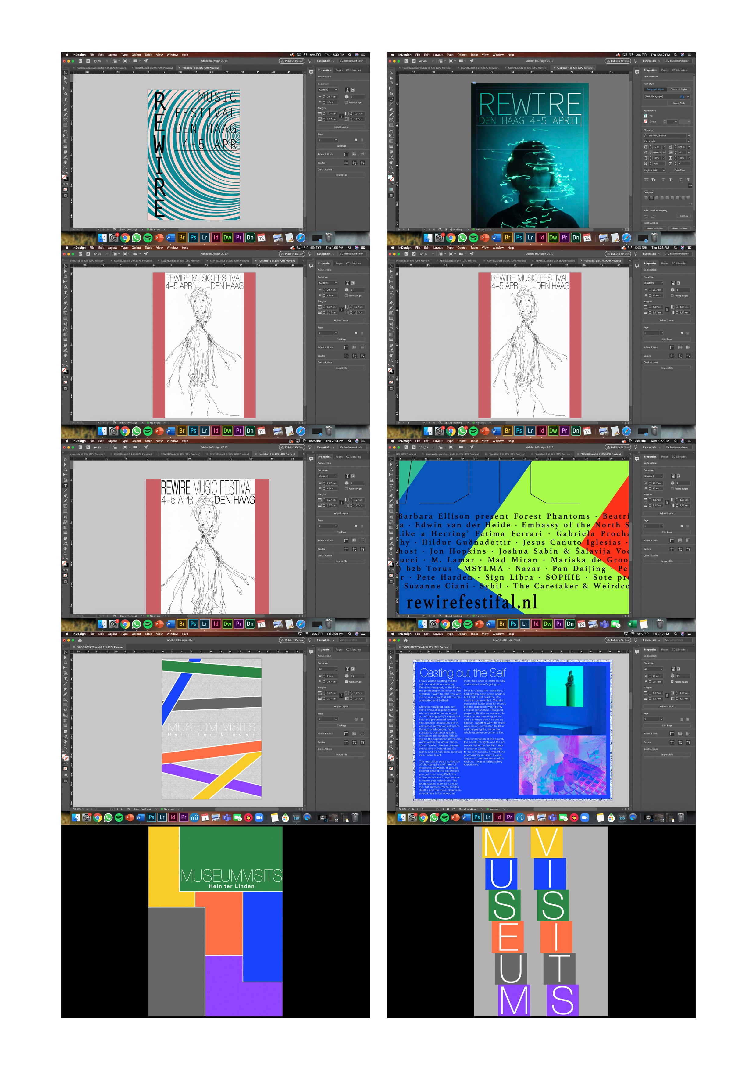
Later you see the Rewire poster designs. I experimented a lot with colour combinations. Do I want to have a sweet looking poster, what colours go with that? Do I want something that looks a bit thougher, what kind of colours do I use then?
The first couple of rewirde designs are varying in colour, nothing else. I decided on a simple lettertype. One that I made and a more classy one.
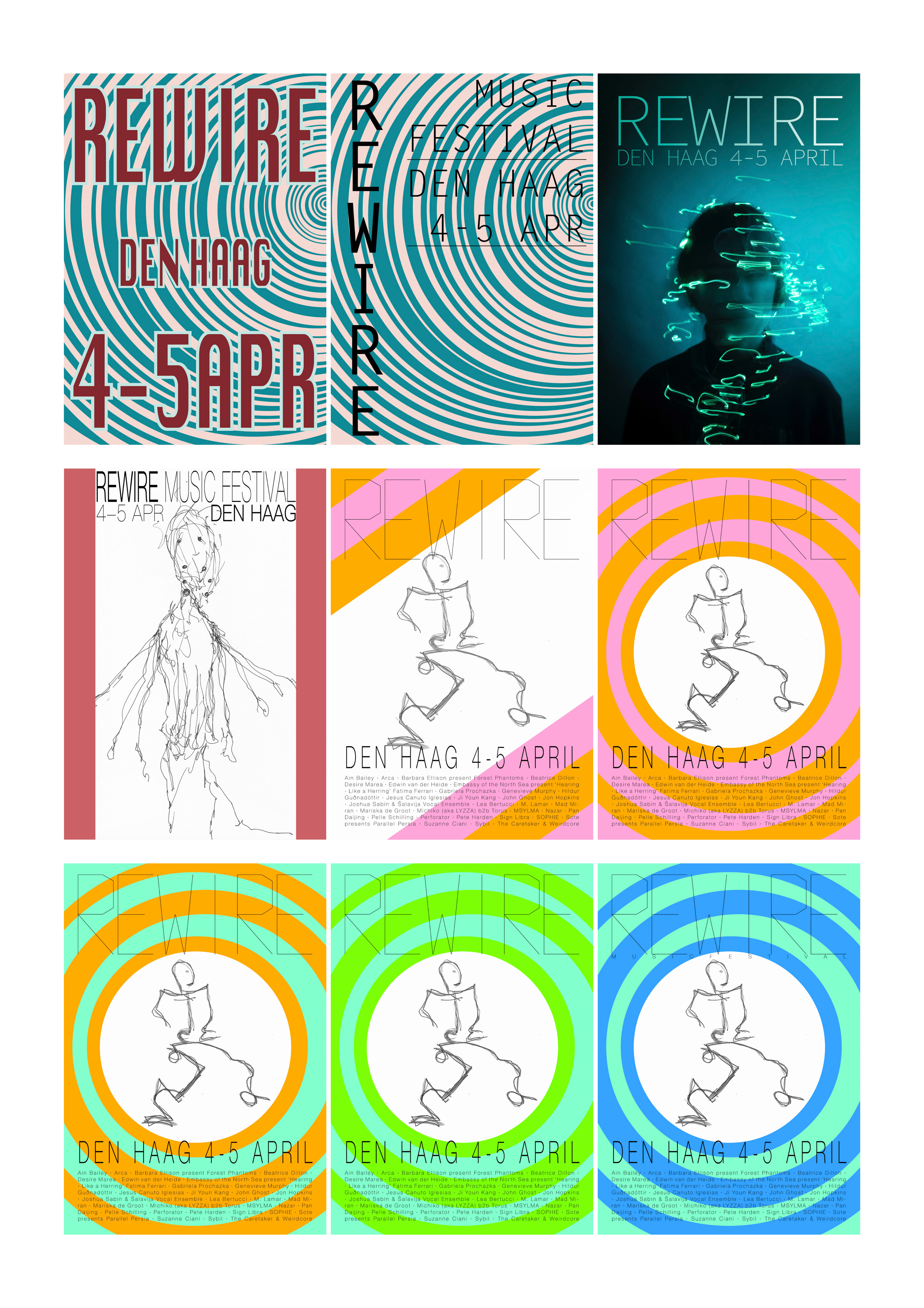
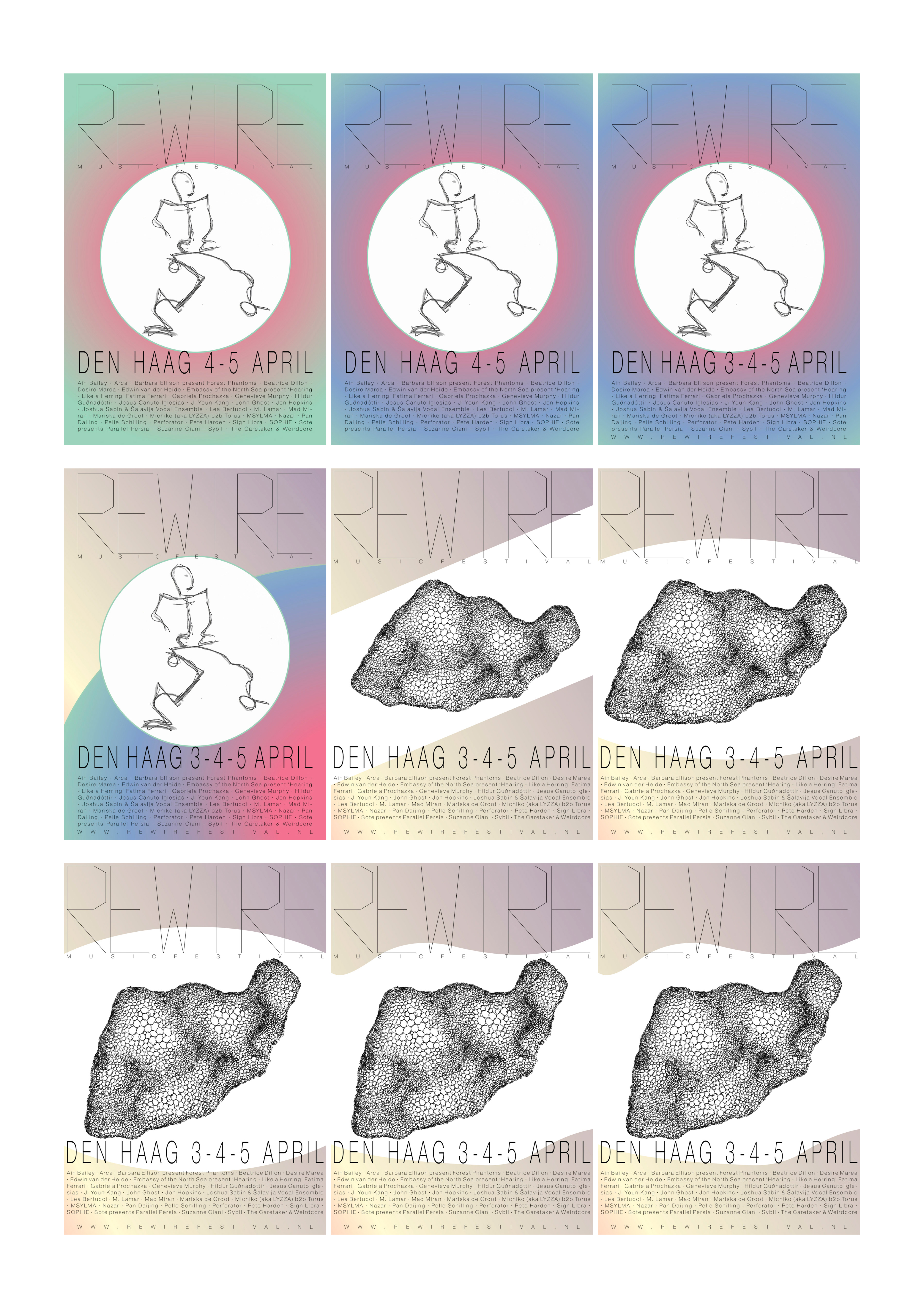
Looking back the colours are really nice but the design overall is very flat. Later I started using circles, this already added a bit of depht but still not enough. I needed something else. Maybe a drawing or a photo?